
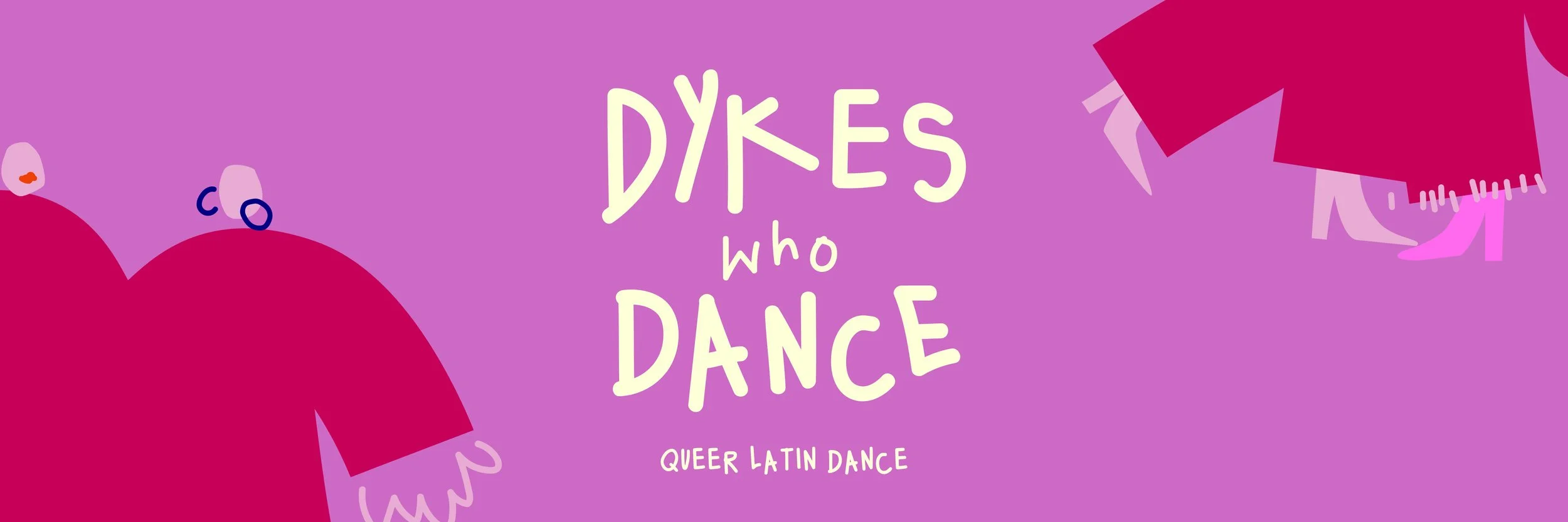
Logo
Brand identity
Illustration
Branding
Dykes who Dance are a queer latin dance group based in Brighton. Founded through a love of Latin dance and a desire to address the lack of queer-inclusive dance spaces.
-
![]()
Colour
Consisting mostly of a hue of pinks and purples, with the royal blue and pale yellow as contrasts, the palette is inspired by the lesbian flag.
-
![]()
Illustration
The playful illustrations were designed to be genderless, playful and dynamic. They complement the logo as well as tie in the brand colours. They are often used in small parts… feet on the corner of a post, peak of a hand on a web banner.
-
![]()
Font
Prioritising authenticity over polish is something truly rooted in the queer community. Creating a bespoke handwritten font is an ode to that. Used for the logo, titles and key information, it is one of the most recognisable parts of the brand identity.
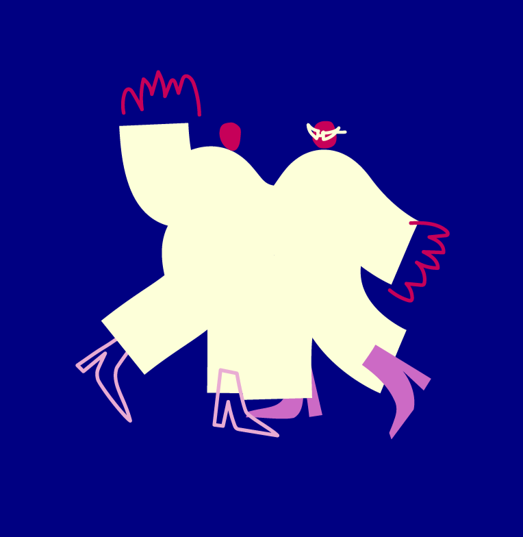
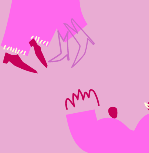
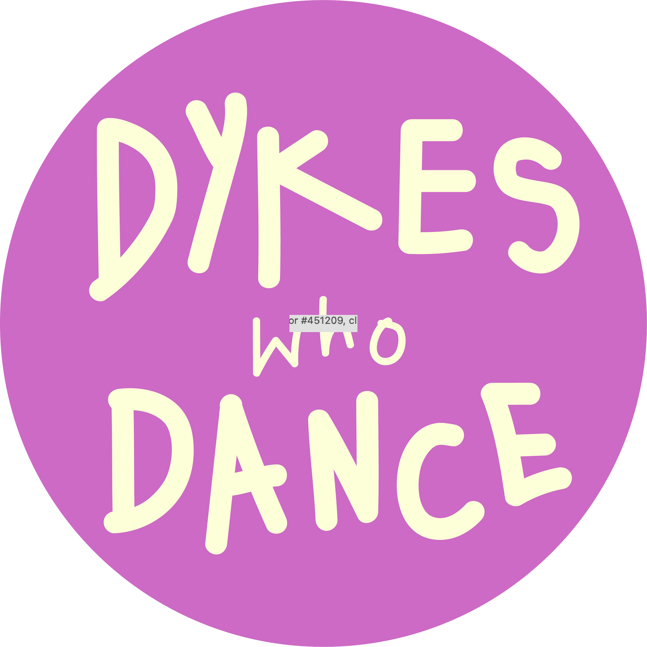
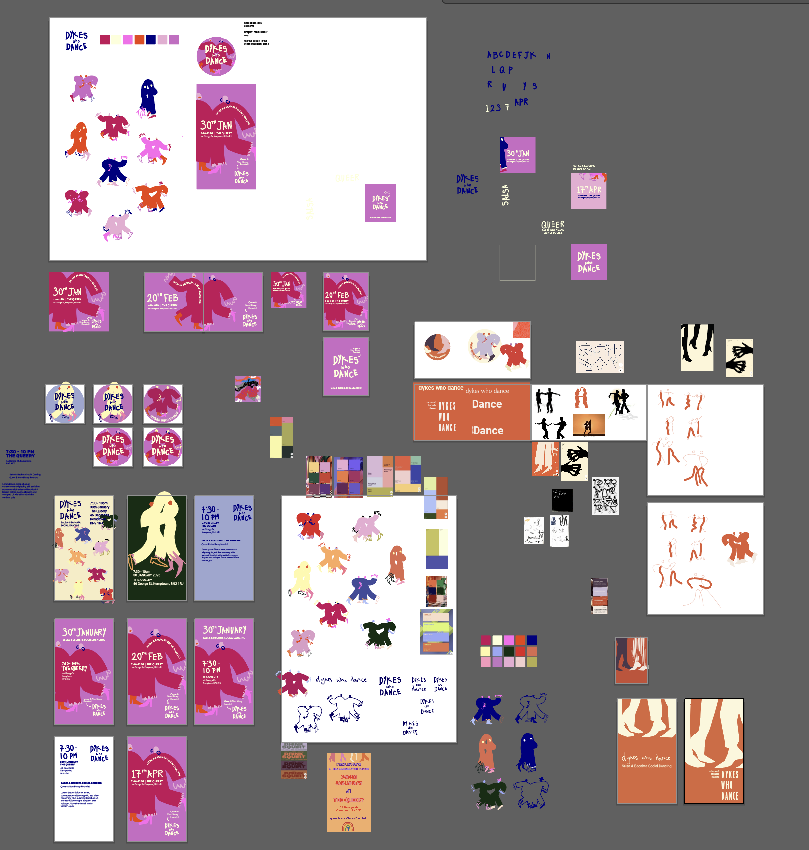
The process board behind the final brand identity... personally I think this is the most interesting bit!
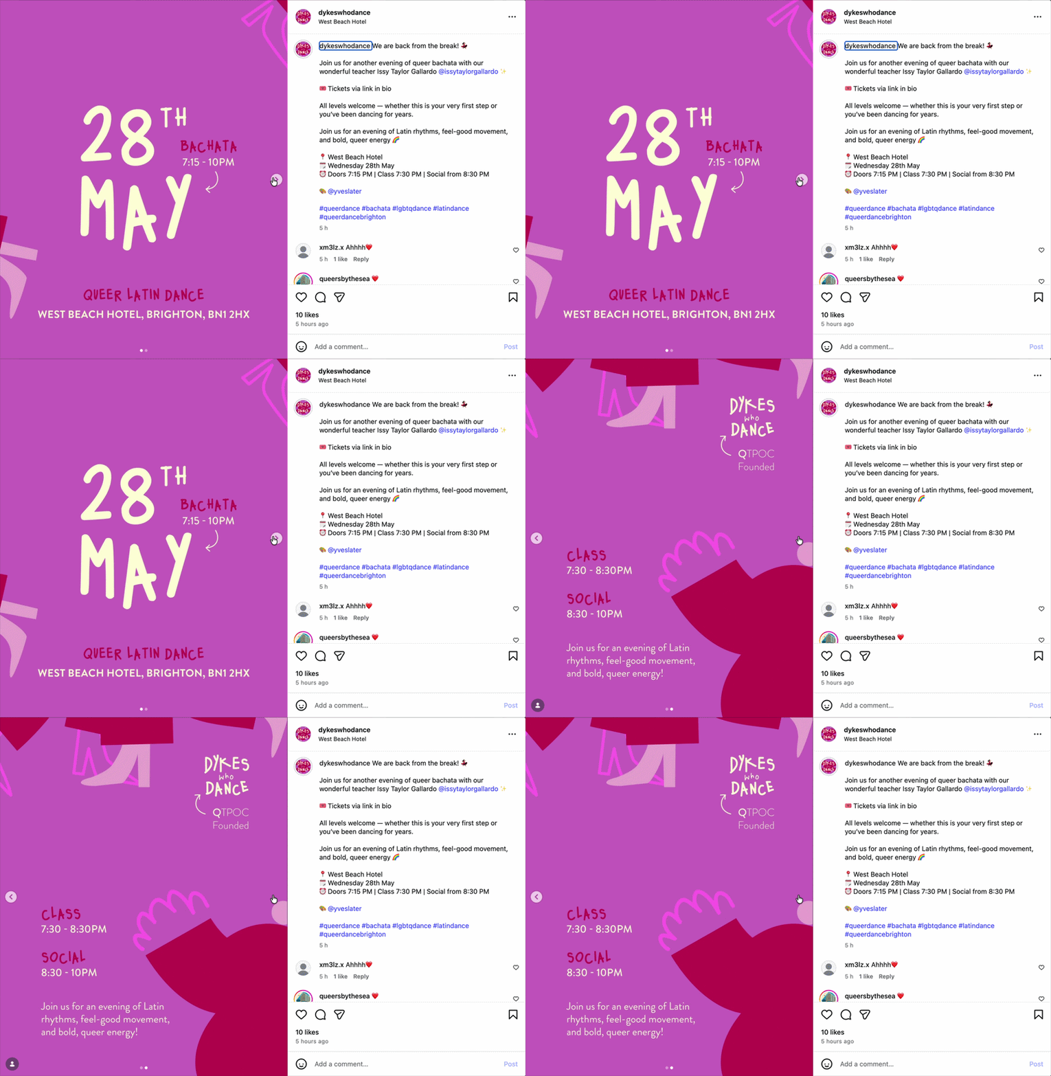
Instagram post
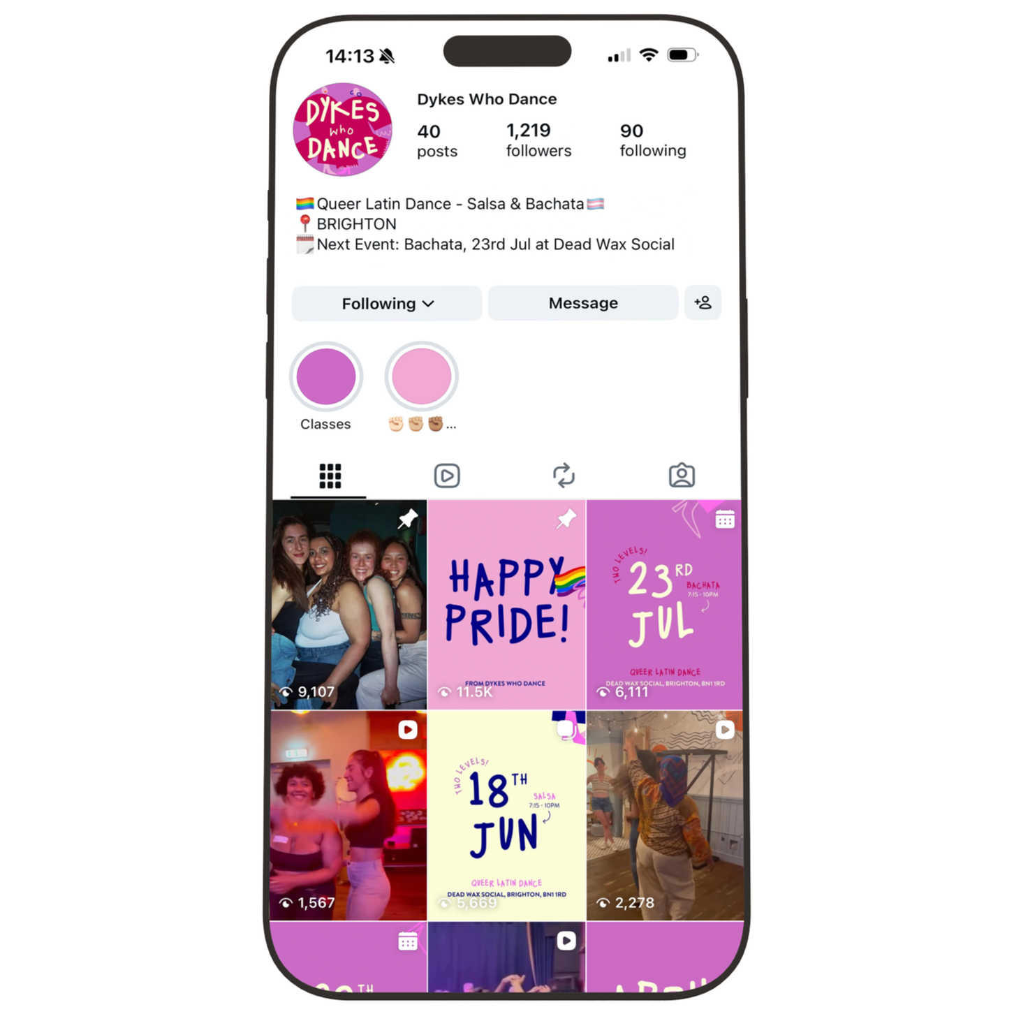
Block colour posts highlight the next save the date. Different colours highlight whether it is salsa/ bachata or a one off dance event.